

ABOUT PROJECT
This is a redesign of the magazine called SUP Standup Paddler. In my publication class we were to pick a magazine off the shelf in a store that we felt needed a redesign. I picked SUP Standup Paddler because the title spreads and color use was lacking in the magazine and I thought I could do a lot with the subject matter inside. The guidelines for the assignment was to do two different covers, two title spreads, two text spreads, a contents page. I did two extra text spreads because I wanted to gain more experience in laying out text in a interesting and more compelling way. What you will see below are my two covers, my contents page, a couple of text spreads covering the same subject matter, a title spread with two text spreads that continued the article from that title spread, and then a title spread for another article in the magazine. My overall goal was to make the magazine more fun and appealing to the viewer since it had to do with such an exciting sport.
This is a redesign of the magazine called SUP Standup Paddler. In my publication class we were to pick a magazine off the shelf in a store that we felt needed a redesign. I picked SUP Standup Paddler because the title spreads and color use was lacking in the magazine and I thought I could do a lot with the subject matter inside. The guidelines for the assignment was to do two different covers, two title spreads, two text spreads, a contents page. I did two extra text spreads because I wanted to gain more experience in laying out text in a interesting and more compelling way. What you will see below are my two covers, my contents page, a couple of text spreads covering the same subject matter, a title spread with two text spreads that continued the article from that title spread, and then a title spread for another article in the magazine. My overall goal was to make the magazine more fun and appealing to the viewer since it had to do with such an exciting sport.

Cover #1
I tried to keep this cover more simple. I didn't want to over fill it with text like many magazines do these days. I wanted the viewer to see the image more then the text!
I tried to keep this cover more simple. I didn't want to over fill it with text like many magazines do these days. I wanted the viewer to see the image more then the text!

Cover #2
This cover is based off of what most magazine's cover layouts look like. The goal was to keep it clean, neat and organized but yet have the text fill the magazine's cover in a tasteful way.
This cover is based off of what most magazine's cover layouts look like. The goal was to keep it clean, neat and organized but yet have the text fill the magazine's cover in a tasteful way.


Awarded a Student Silver ADDY (2013) Category: Publication Design for Editorial/Feature Spread.


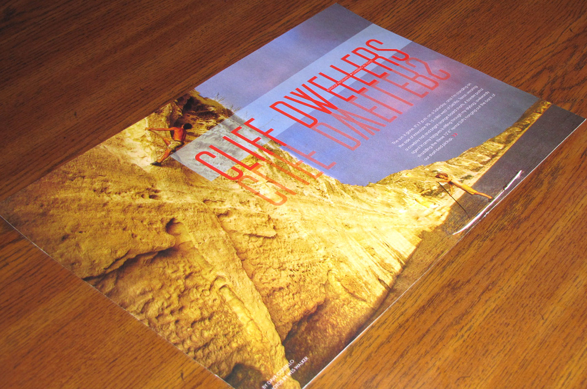
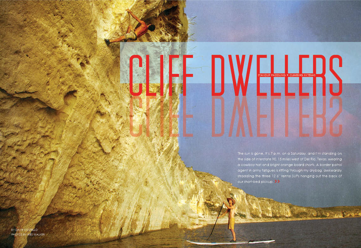
Closer view of Cliff Dweller title spread.
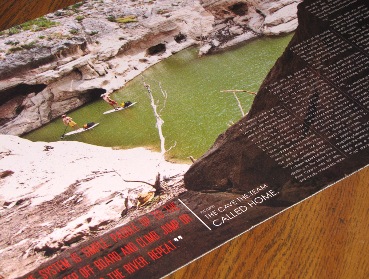
Closer view of one of the Cliff Dweller article text spreads.

Closer view of the other Cliff Dweller article text spreads.
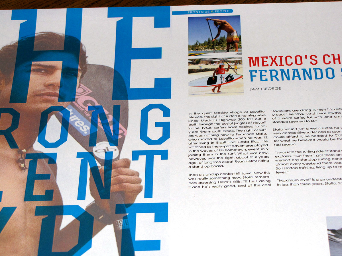
Closer view of the title spread for The Strong Slient Type article.

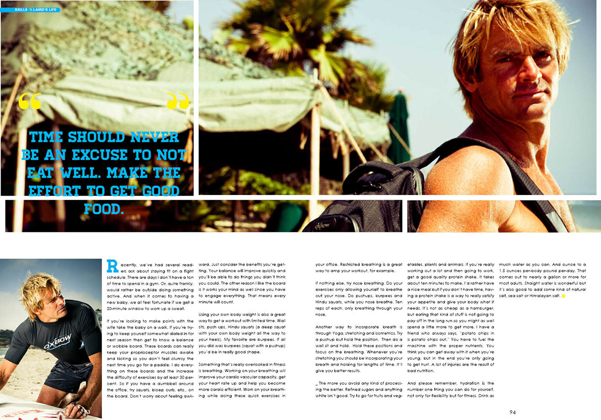
Two different text spread variations of the article by Larid Hamilton.
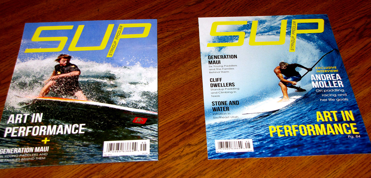
The two covers next to each other.
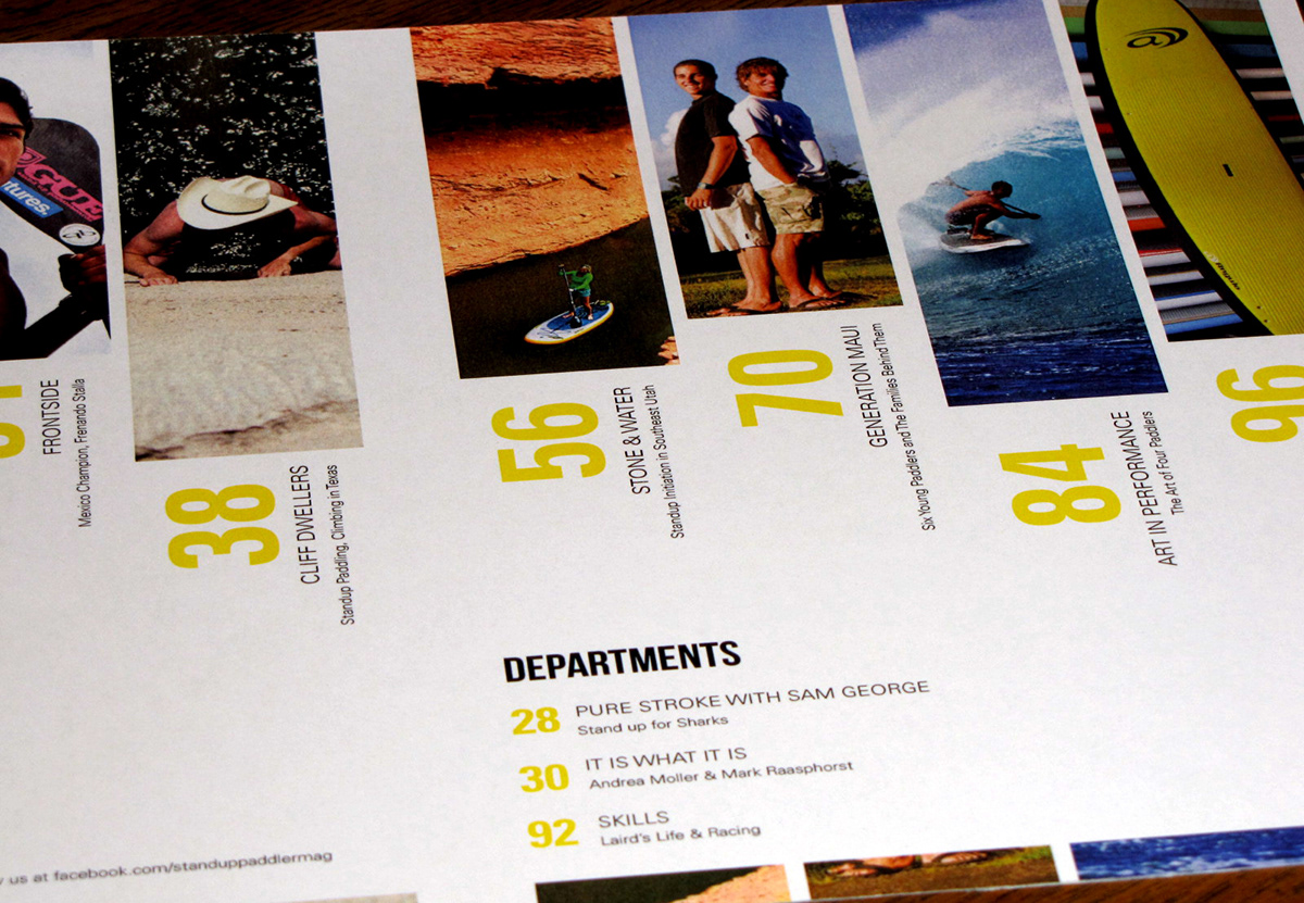
Closer view of the table of contents spread.


